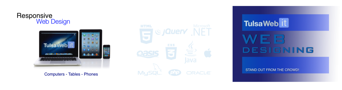
Mobile / Responsive Website Design

Mobile Web Design….The latest and Most Advanced Technology
When was the last time you looked at your website from your smart phone? You might be surprised to learn that the layout, the graphics and the design are not showing up correctly because desktop websites were not created to be seen on a mobile device. Websites that have not been designed with a smart phone in mind, are usually not compatible with a mobile device and will in all likelihood appear smaller than you anticipated, contain much larger images and be hard to read.
Is your website ready for the Mobile Revolution?
American Adults
With Smartphones
Smartphone Users
That Access The Web Daily
Local Business Websites
Not Optimized For Mobile Devices
Make Your Website Accessible Via Your Smart Phone with Responsive Web Design
What you may ask is the difference between having a desktop website and a mobile website?
The answer is simple. When a visitor tries to access your website on their smart phone, it has to be user-friendly with the mobile device or it’s going to look distorted. If the design is not optimized and laid out correctly, the viewer may see the wrong content or worse they may view what appears to be a disorganized arrangement of words and design, which of course can’t be good for business.
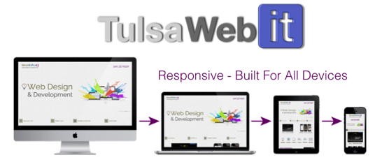
Google wants websites to work correctly on ALL devices and they recommend that the sites be “responsive” designed websites. Responsive web design is a technique to build web pages that alter how they look using CSS3 media queries. That is, there is one HTML code for the page regardless of the device accessing it, but its presentation changes using CSS media queries to specify which CSS rules apply for the browser displaying the page. This is Google’s recommended configuration.
Below is from SearchEngineNews.com regarding responsive web design:
“Google has decided to reward sites for site performance that has nothing to do with relevancy. In fact, no matter how ‘relevant’ your site may be to your market niche, Google thinks it’s more important that your Web site load fast and display ‘normally’ on all viewing devices. This includes iPhone, iPad, Android devices, desktops and laptops.
In a word, they’re saying that your site had better be “Responsive” …referring to a new type of Web design that completely trashes the Web design that most companies are using and effectively demands that you change your site architecture right now, or else.
Yep. Evil. But it IS the way it IS. The question is: what are you going to do about it? …cry? …or play to win?”
An Optimized Mobile Web Design
With the number of smart phones in existence and growing daily, millions of people could potentially gain access to your website with their mobile device, but what will they see? If you don’t have a website that is compatible with a mobile device, you could be losing a great deal of business.

The advantages of a mobile web design are many and include the following:
• Generates new business
• Enables easy navigation
• Improves the user experience
• Is interactive and easy to access
• Makes surfing more fun and much easier
• Improves SEO performance
• Rankings rise on mobile-friendly search engines
• Increases business visibility
If your mobile website is optimized, it means that it’s been designed to fit precisely on the smaller mobile device screen. That way, everything is displayed correctly and in turn, navigating is easy and efficient.
Mobile Web Designs Are Growing in Leaps and Bounds
Each year, over one million cell phones are replaced and traded in for a smart phone, which means millions upon millions of people are using their smart phones to access websites. In fact, more people are now using their smart phones versus their desktops to access the web, so a mobile web design gives you greater reach, more flexibility, and the opportunity to make contact with those looking for your services and products. Remember, if a visitor accesses your website from their mobile device and it’s not compatible, the odds are you will lose that potential customer.
Mobile designs are the fastest growing strategy on the web. Shouldn’t your website be one of those websites that are compatible with your smart phone? If you’re ready to join the mobile revolution, we at Tulsa WebIT are ready to help you make it happen, quickly, simply and cost effectively. We work hard and diligently to keep up with the latest technology, so we are constantly monitoring our software to be sure it works well with the latest and most up-to-date platforms. The best part of all is that your customers will see your website exactly as you intended.
To learn more about our mobile web design, contact us at 918-899-1932 or toll free at 800-591-2815. Or if you prefer, you can complete our Free Online Request Form and someone will be in touch promptly.
We are your source for Responsive Web Design in Tulsa
Tulsa WebIT is conveniently located in the Tulsa area and we offer our mobile web design services to the following cities locally, however we can service clients worldwide:
Ada, Altus, Ardmore, Bartlesville, Bethany, Bixby, Broken Arrow, Chickasha, Choctaw, Claremore, Del City, Duncan, Durant, Edmond, El Reno, Elk City, Enid, Glenpool, Guthrie, Guymon, Jenks, Lawton, McAlester, Miami, Midwest City, Moore, Muskogee, Mustang, Norman, Oklahoma City, Okmulgee, Owasso, Ponca City, Sand Springs, Sapulpa, Shawnee, Stillwater, Tahlequah, Tulsa, Warr Acres, Weatherford, Woodward, Yukon, OK. Also serving Bentonville Arkansas, Rogers Arkansas, Fayetteville Arkansas and Joplin Missouri
CONNECT
TULSA Web IT, LLC
10764 S. 93rd E. Ave.
Tulsa, Oklahoma 74133
(918) 899-1932
Corporate Email
Admin@TulsaWebIT.com